The visual part of the marketing mix


Visual marketing is an important part of delivering your message
With digital media becoming more important in our lives we’re all having to embrace this way of communicating. And that’s what digital is, a way of communicating.
Digital communications often include graphic elements. I’m not just talking about pretty pictures or ‘cool’ design here. The way things are laid out and presented can convey such a great amount of information, meaning and emotion.
Online tools like Canva are opening up the world of graphic design to many people.
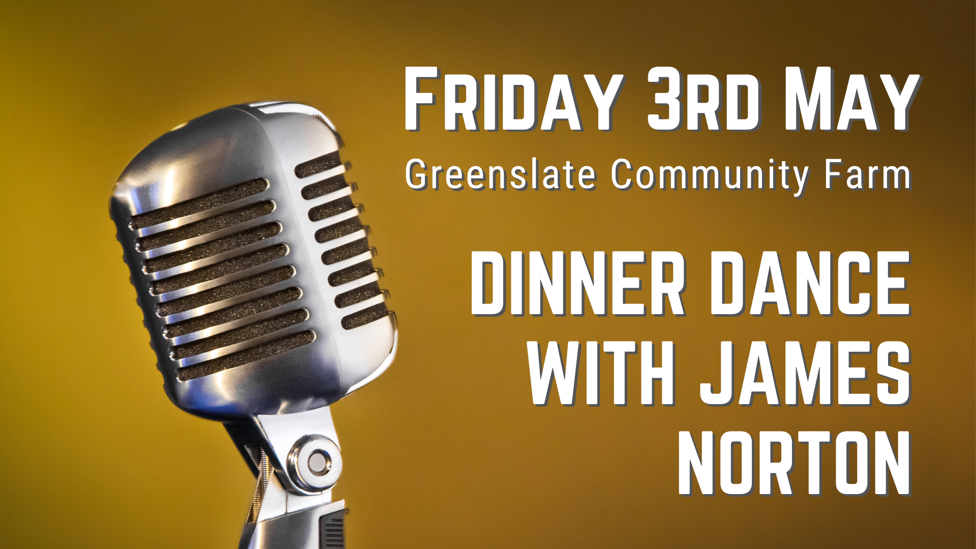
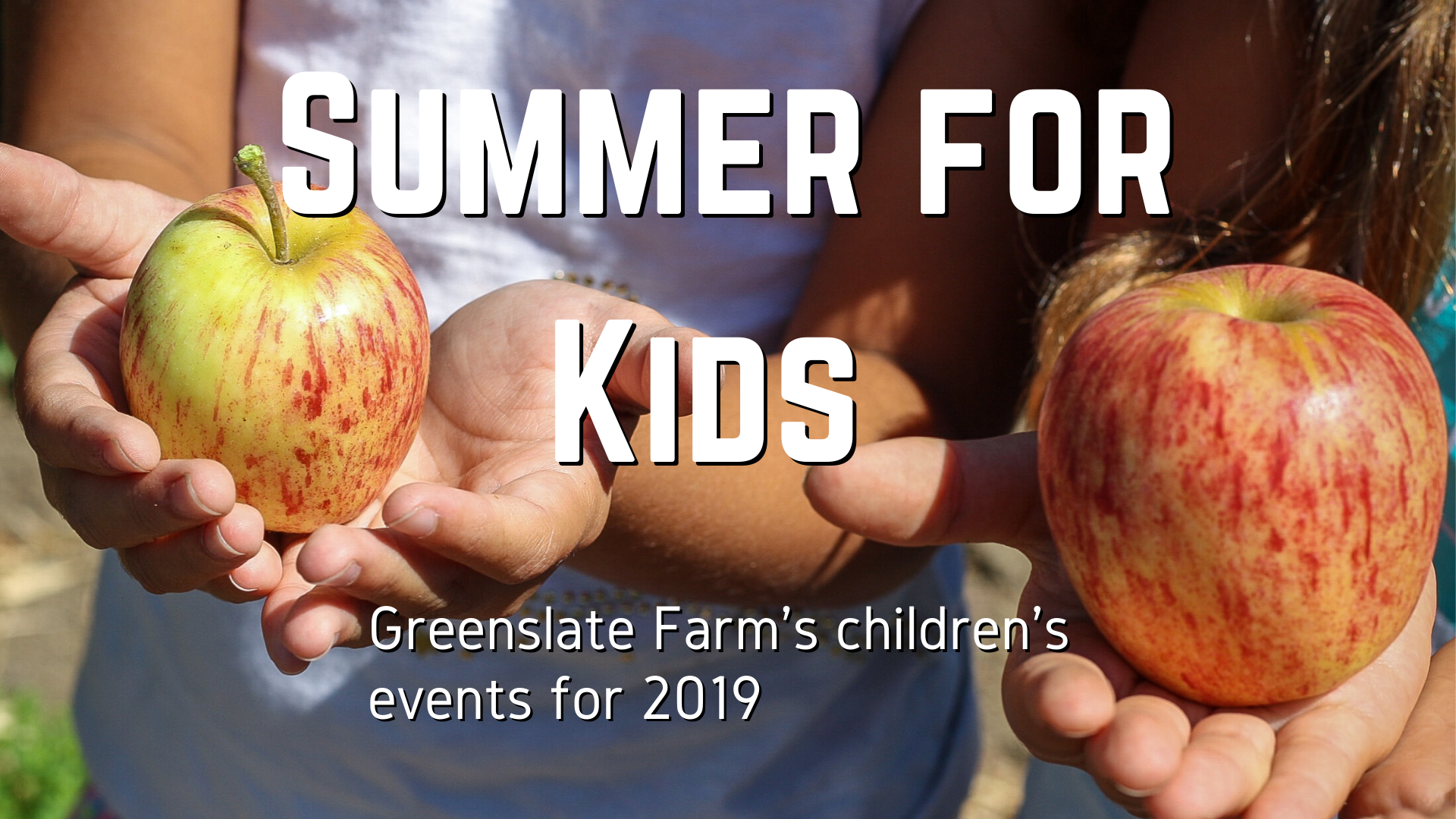
I started to look back at the campaigns we’ve run for events over the last few years at Greenslate, I have been doing lots of design work.
When I just concentrated on photography as a career, I was a massive Photoshop user. I also spent more hours than I like to think about creating graphics in Adobe Illustrator, making posters etc.
These days, I try not to use those tools because I’m taking a more minimalist approach to life and want to simplify things, slim them down, become more efficient at what I do.
For about a year now I’ve been using a handy tool called Canva. It doesn’t have anything like the massive possibilities of Photoshop and Illustrator, but I think that’s its strength.
Less is more
I believe having narrower options can actually stimulate your creativity. Having a simpler toolset makes you concentrate on the design and speed up your production. The constraints become part of the process by giving less creative choices.
Canva has freed me up by encouraging me to spend less time designing and more time on other parts of the promotion work I have to do. Things like writing copy or adapting the design to fit onto the website.
The tools in Canva are the basics you need to create something usable. They’re tools that fulfil 90% of people’s needs.
Great features
Probably the biggest feature within Canva I love the most is the ‘resize’ facility. When you have to adapt your design to work across different platforms, this is a real time-saver.
For a typical campaign, I’ll have to produce:
- A poster
- An A5 flyer
- A Facebook event post
- A Facebook page post
- An Instagram post
- A website page graphic
- A website feature image
- Several Facebook and Instagram post updates
All of those formats use different shape ratios, sizes, resolutions and graphic types. Doing all of that in Photoshop and/or Illustrator would be a massive time-suck. Doing it in Canva is much quicker.
Canva allows me to resize designs and generate multiple versions. And, it gives me the ability to split off different elements of a design for use on a website.
I export elements of the design as transparent .png files to reassemble them on the website. This way the web design matches the other media I create.
I’m not ready to put ‘Graphic Designer’ on my CV, but I’m happy to acknowledge Graphic Design is a developing skill within my toolset.
New tools change the game
Let’s face it, a tool like Canva could take work away from graphic designers. High-quality camera phones took work from me as a professional photographer.
I remember web designers turning their noses up at WordPress as a website platform years ago, but now loads of them use it.
Technology is changing the world week by week, and there will always be a space for the professional. But, tools like Canva can put professional levels of graphic design into the hands of ordinary people.
There are some skills to learn when using Canva, but the learning curve is much smaller than using the heavyweights of Photoshop and Illustrator.
If you’re marketing online for your business, having these skills is becoming a necessity if you need to represent yourself and promote your business.
If you want to know more about using these tools in your business or would like me to help you with your campaigns, don’t hesitate to contact me. Send me a question today.
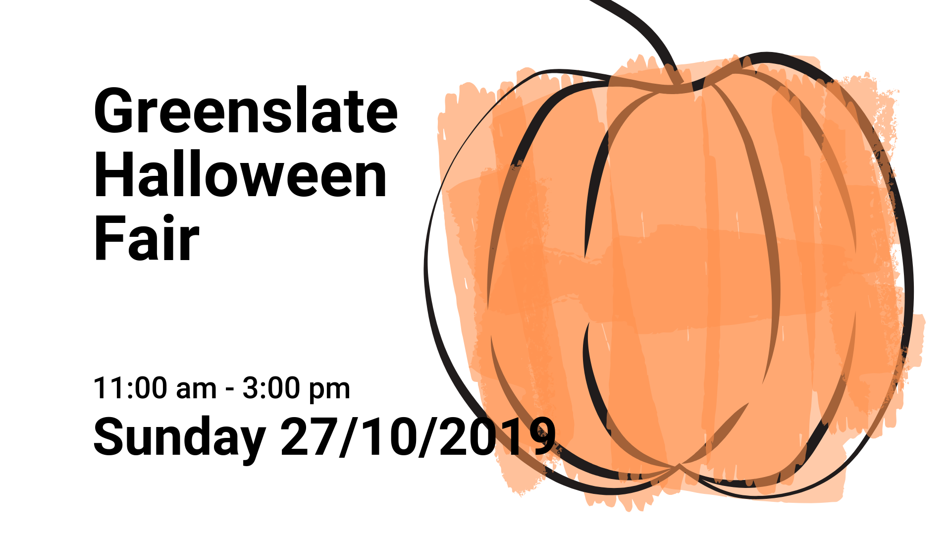
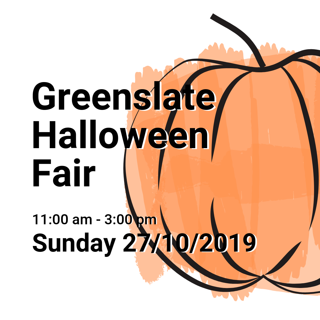
Greenslate Halloween Fair 2019
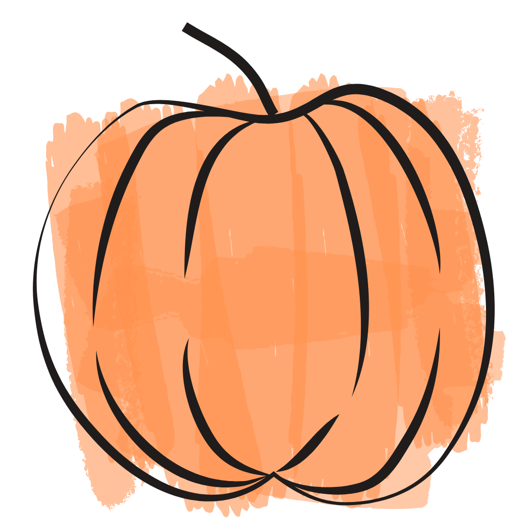
Pumkin graphic element
I wanted to go minimalist on this one. It’s too easy to get carried away with spooky fonts and cliche scary graphics with something like Halloween.
The pumpkin image was a free vector graphic in Canva’s elements library, as were the brush strokes which were copied multiple times and applied with different levels of transparency to give the impression of watercolour brush strokes.
By saving the pumpkin as a transparent .png image file, I was able to re-import it into the other graphic files and also use it on the website.
We have settled with Roboto as our standard font used in different weights.
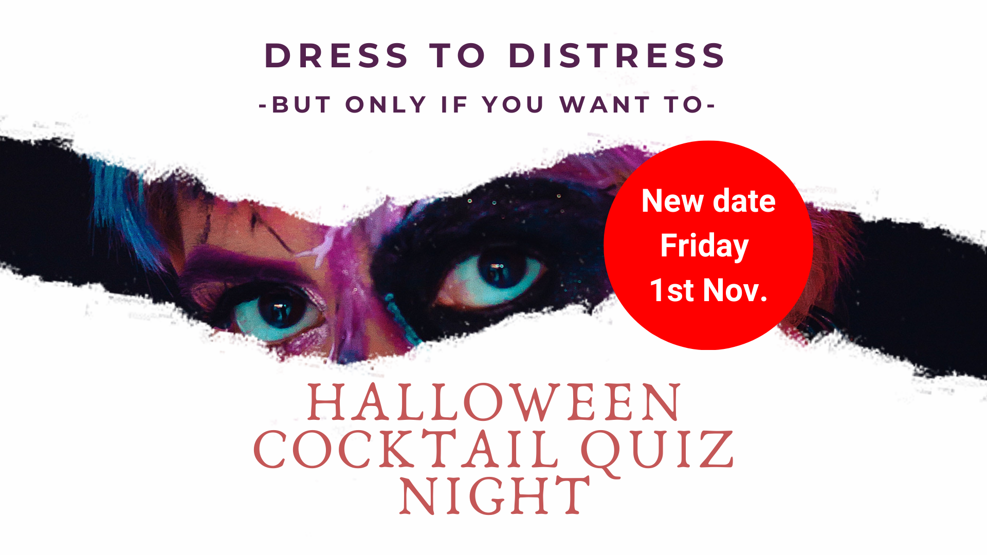
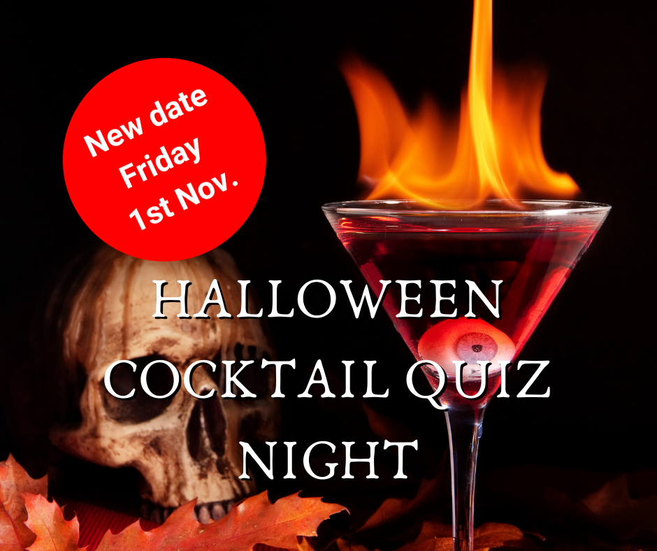
Halloween Cocktail Quiz Night
Another minimalist design built around a striking image and some ragged-edged masking which gives a sinister but intriguing graphic drawing you in. The white space around the image seems to add power to it.
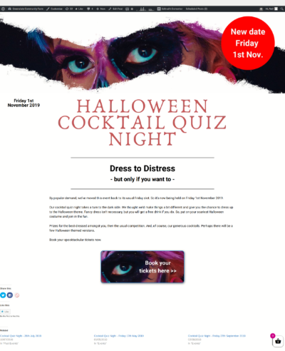
I broke out of using just one font by adding the Anakatoria font to the pallet for the Canva graphics. This led to a problem though. I didn’t have that font available in the free version of Elementor, the WordPress graphic layout tool I use of the Greenslate website. I experimented with similar looking fonts, but in the end, I exported the title text as a transparent .png file which I used as an image on the website.
Initially, the event had been scheduled for Thursday 31st October, Halloween itself. However, we have a regular monthly crowd for the usual Friday night cocktail quiz night, so we had to reschedule it back to the Friday night, 1st November. So I ended up putting the big red dot there announcing that the event was now back on Friday.
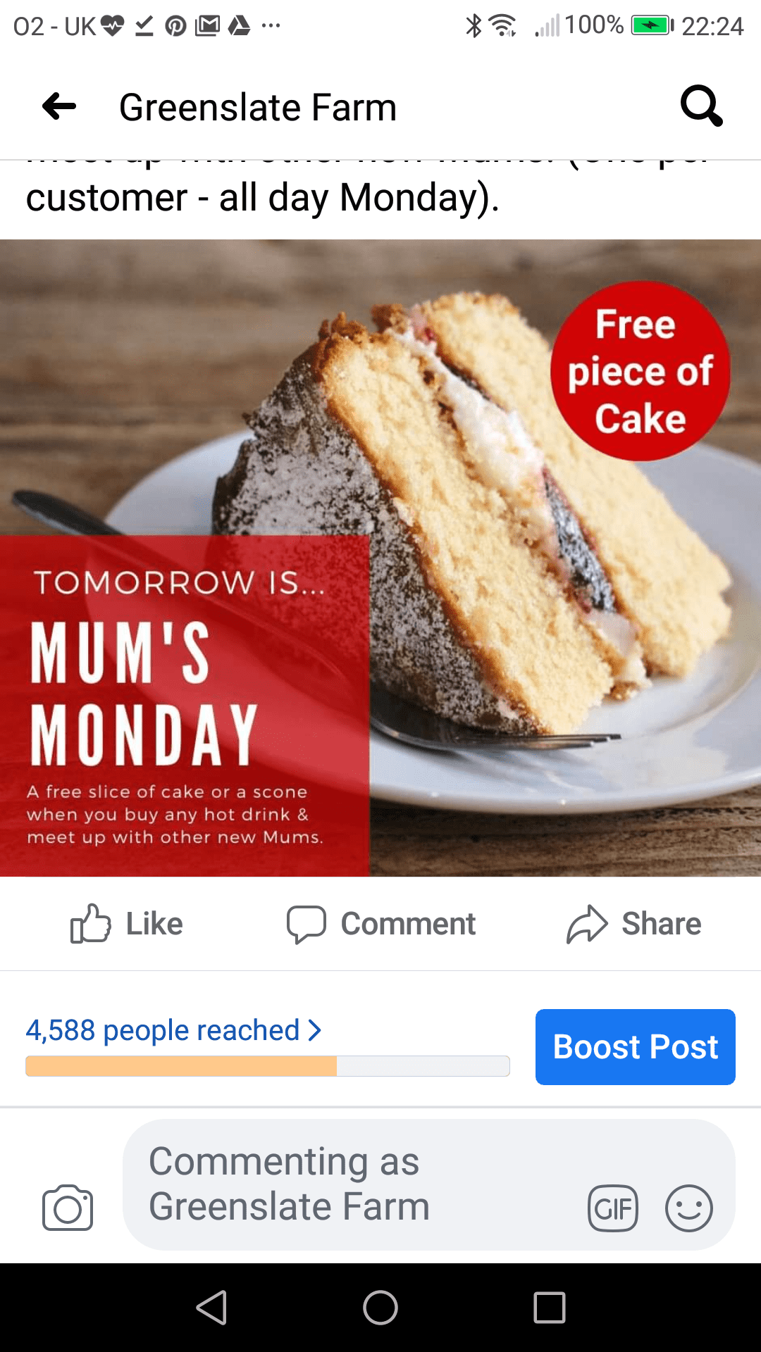
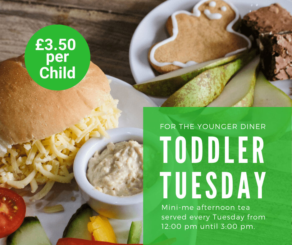
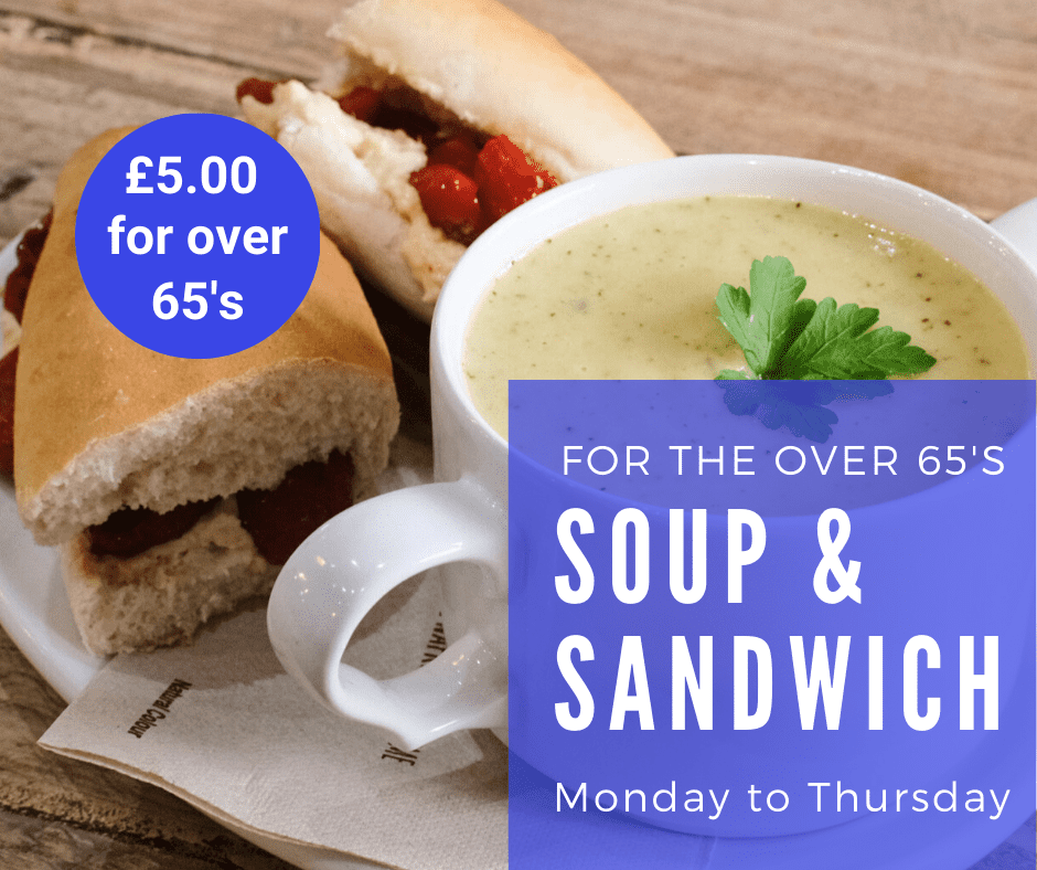
Greenslate’s cafe is usually really busy from Friday right the way through the weekend. Monday to Thursday is relatively quiet in comparison.
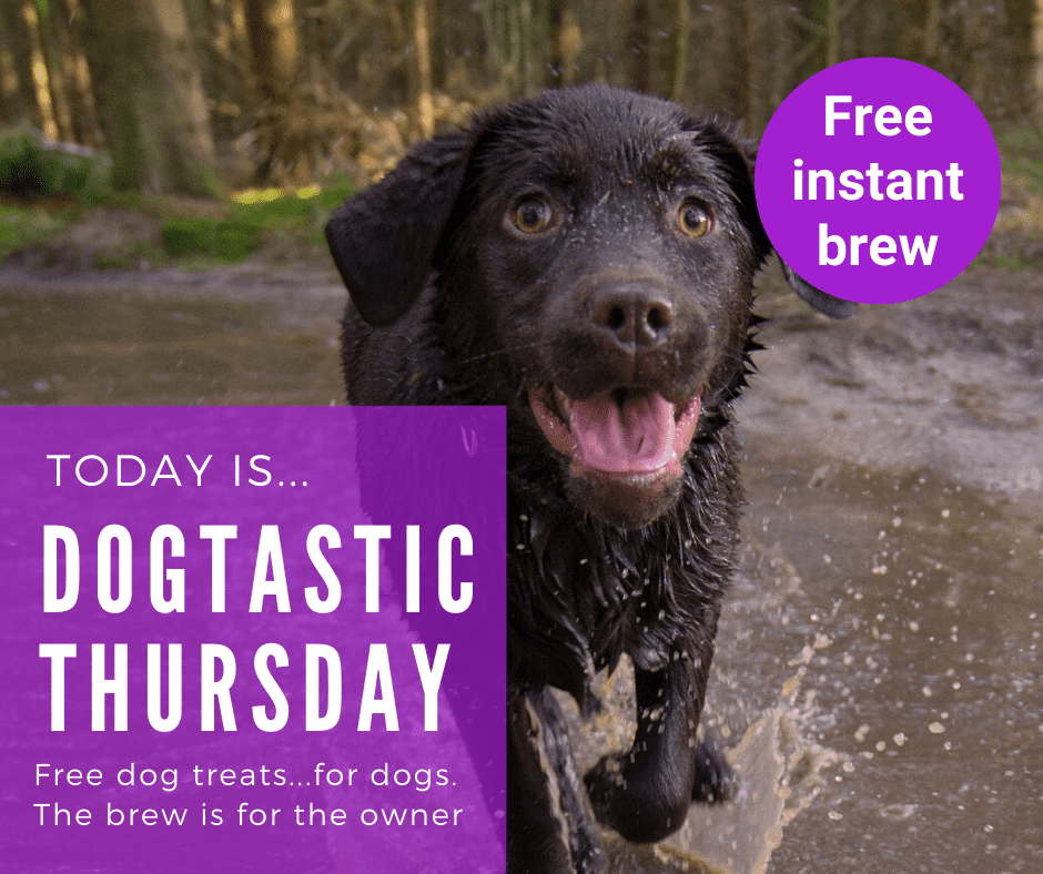
We decided it would be good to run some promotions during the week, and target them at groups we know love the cafe. We have run promotions like this before, but they have only had moderate success.
This series of Instagram and Facebook posts I put together for Greenslate seem to have done really well with great audience engagement and a few compliments about the designs.
As you can see from the Facebook screenshot for ‘Mum’s Monday,’ a 4.5k reach isn’t bad for a tiny cafe that’s building its reputation in the area. It’s one of the best figures we have managed so far for organic social media. We have never paid for advertising on social media yet.
Has the design helped? It certainly seems to have caught people’s eye and the food looks great. They are also really good offers, and you won’t get anywhere unless people are interested in what you’re offering.
Images make a big difference to social media engagement and good graphics are significant too.
Roll all these things out together and you have the makings of a successful campaign. People are happy to spread the good news.

